Posted 9 a.m. Wednesday, May 3, 2023

Determining the reliability of data in news sources
By Liz Humrickhouse (she/her/hers)
Today, more than ever, it can be difficult to distinguish between reliable and unreliable news coverage. While there’s no magic formula for determining if a news story is trustworthy, there are several strategies that can help us make an informed decision. Keep reading to learn about techniques for making sense of data used in news reporting and for evaluating a news source.
Look for context
Data is commonly used to create context for a news story. You can probably think of news coverage you’ve read or watched recently that used a graph or infographic to enhance the reporting, but how do you know if these charts, data sets and polls are reliable?
Start by asking yourself, “How is the data being used in a news story?” For instance, does the data being used match the argument being made? Here’s an example of how a graph used without context can be misleading. Look at the graph below and try to interpret the data presented.
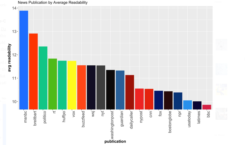
If this chart was used in a news story about which news outlets publish the most “readable” stories, that is, news reports that the largest number of people can read and understand, we might assume that MSNBC produced the most readable news stories while the BBC produced the least readable. Without additional context, that would be a logical conclusion to draw.
Without more information about how to interpret this graph, we can’t determine whether or not the news story where it was used provided us with an accurate interpretation. An ethical news organization would provide its audience with the additional information needed to accurately interpret this graph. At the very least, a news outlet should cite its sources and tell its audience where the graph comes from. In this case, the graph comes from the article “How Smart is Your News Source?” In this article, the author conducted several analyses of different news outlets and the articles they published to draw conclusions about sentiment, readability and bias among other topics. For the graph in question, the author provided the following context,
“The Flesch-Kincaid readabilty test is one of the most popular. It creates a score based on the number of words per sentence and on the number of syllables per word — i.e. long words and sentence are harder to read. It then converts this score to a grade level. Note that this result has nothing to do with the content of the sentences analyzed. It is solely based on the length of words/sentences.
Using this method, we see that MSNBC has the highest grade level making it the hardest to read. This is likely because MSNBC ‘stories’ are just descriptions of the news videos on the site. They are designed to be descriptive, not necessarily readable. All other sites contain proper articles, even network news sites like CNN and FoxNews.
At the opposite end of the spectrum, BBC news articles can be read comfortably, requiring only a 10th grade education. This is likely because most BBC stories are short and informative (with fewer meandering editorials).”
Now we know the author’s analysis of the readability of each news organization was based on the length of words and sentences used in each story, not on the content of the sentences. Based on this analysis, the BBC’s stories are less structurally complex and require only a 10th grade reading level, while the MSNBC stories require a grade 13-14 reading level. Further reading in the original source reveals that the author ran several other readability analyses which resulted in news outlets swapping spots on the graph.
Make an informed decision
Now that we know more about the graph and how the information represented in it was developed, we can make a decision about whether or not it was portrayed accurately in the news story we read. Remember, in our hypothetical news story, this graph was used as evidence to support the claim that MSNBC produces the most readable news stories. So, is this claim accurate?
The answer is no, not really. There might be other readability analyses that rank MSNBC as the most readable, but this chart shouldn’t be interpreted in that way. In this case, we can determine that our hypothetical news story is using data out of context to support its claims.
How to determine if a news organization is trustworthy?
Since we’ve determined that our news story used this chart incorrectly, the next logical question we might ask ourselves is, “Can we trust this news outlet at all?” Did they knowingly use this data out of context or was it an honest misinterpretation error? That is a more difficult question to answer, but fortunately, there are tools in place to help you make a determination.
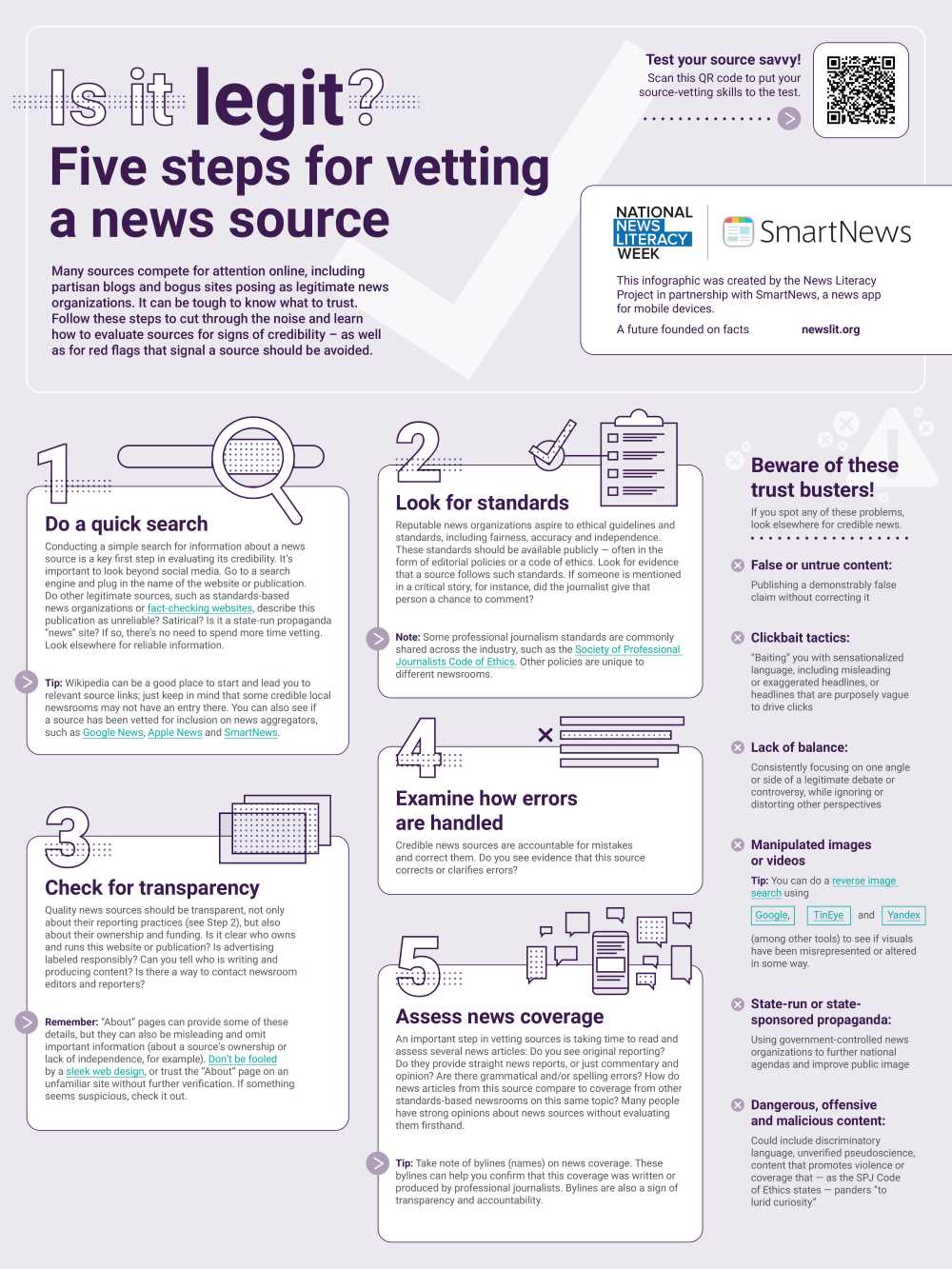
The News Literacy Project is an organization that produces tools for educators and K-16+ students to help build news literacy. They’ve produced the following infographic to be used as a guide for vetting a news source. Remember that this infographic represents just one set of strategies produced by one organization, so you should think about and seek out other strategies for determining trustworthiness. Can you think of any strategies you use to vet news sources?